
为何DataFrame含datetime类型时Matplotlib动画无法正常运行?

2026-6-29
时序数据滚动窗口动画修复方案
问题背景
在Google Colab中对一维时序数据实现滚动窗口动画时,当timestamp列为datetime类型,Matplotlib动画无法正常生成——窗口矩形无法随时间轴滚动,即使将timestamp设为索引也无效。
原错误代码
#-----------------------------------------------------------
# Libs
#-----------------------------------------------------------
import numpy as np
import pandas as pd
import matplotlib.pyplot as plt
from matplotlib.animation import FuncAnimation
from matplotlib.patches import Rectangle
from IPython.display import HTML

#-----------------------------------------------------------
# LOAD THE DATASET
#-----------------------------------------------------------

df = pd.read_csv('https://raw.githubusercontent.com/amcs1729/Predicting-cloud-CPU-usage-on-Azure-data/master/azure.csv')
df['timestamp'] =  pd.to_datetime(df['timestamp'])
df = df.rename(columns={'min cpu': 'min_cpu',
                        'max cpu': 'max_cpu',
                        'avg cpu': 'avg_cpu',})
df.head()


# Data preparation
# ==============================================================================
sliced_df = df[['timestamp', 'avg_cpu']]
# convert column to datetime object
#sliced_df['timestamp'] = pd.to_datetime(sliced_df['timestamp'], format='%Y-%m-%d %H:%M:%S')
#df = df.set_index('timestamp')


step_size = 4*287
data_train = sliced_df[:-step_size]
data_test  = sliced_df[-step_size:] #unseen


#-----------------------------------------------------------
# Animation
#-----------------------------------------------------------

# create plot
plt.style.use("ggplot")  # <-- set overall look
fig, ax = plt.subplots( figsize=(10,4))

# plot data
plt.plot(list(sliced_df['timestamp']), sliced_df['avg_cpu'], 'r-', linewidth=0.5,  label='data or y')

# make graph beautiful
plt.plot([], [], 'g-', label="Train", linewidth=8, alpha=0.3)
plt.plot([], [], 'b-', label="Test",  linewidth=8, alpha=0.3)

step_size = 287
selected_ticks = sliced_df['timestamp'][::step_size]
plt.xticks(selected_ticks, rotation=90)
#plt.gca().xaxis.set_major_formatter(mdates.DateFormatter('%Y-%m-%d %H:%M:%S'))


Y_LIM       = 2*10**8 #df[f'{name_columns}'].max()
TRAIN_WIDTH =  288*27
TEST_WIDTH  =  357*1
print(TRAIN_WIDTH)
print(TEST_WIDTH)

#plt.title(f'Data split:\n taraing-set {100*(len(data_train)/len(df)):.2f}% = {TRAIN_WIDTH/288:.2f} days and test-set {100*(len(data_test)/len(df)):.2f}% = {TEST_WIDTH/288:.f} days')
plt.title(f'Data split:\n taraing-set % =  days and test-set % = days')
plt.ylabel(f' usage',   fontsize=15)
plt.xlabel('Timestamp', fontsize=15)
plt.grid(True)
#plt.legend(loc="upper left")
plt.legend(bbox_to_anchor=(1.3,.9), loc="upper right")
fig.tight_layout(pad=1.2)


def init():
    rects = [Rectangle((0, 0)              , TRAIN_WIDTH, Y_LIM, alpha=0.3, facecolor='green'),
             Rectangle((0 + TRAIN_WIDTH, 0), TEST_WIDTH,  Y_LIM, alpha=0.3, facecolor='blue')]
    patches = []
    for rect in rects:
            patches.append(ax.add_patch(rect))
    return patches

def update(x_start):
    patches[0].xy = (x_start, 0)
    patches[1].xy = (x_start + TRAIN_WIDTH, 0)
    return patches


# create "Train" and "Test" areas
patches = init()

ani = FuncAnimation(
    fig,
    update,
    frames= np.linspace(0, 288, 80),  # all starting points
    interval=50,
    blit=True)


HTML(ani.to_html5_video())
当前输出

期望动画效果
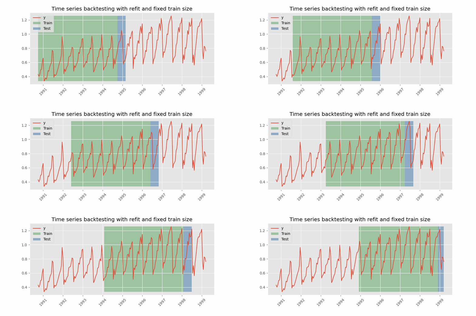
核心问题与修复方案
原代码的致命错误是用整数数值直接偏移datetime类型的x轴——Matplotlib的datetime轴实际是用浮点数(距离epoch的天数)存储的,直接用整数步长移动矩形会导致坐标不匹配,窗口无法正确跟随时间轴滚动。
修复后的完整代码
import numpy as np
import pandas as pd
import matplotlib.pyplot as plt
from matplotlib.animation import FuncAnimation
from matplotlib.patches import Rectangle
from IPython.display import HTML
import matplotlib.dates as mdates

# 加载并预处理数据集
df = pd.read_csv('https://raw.githubusercontent.com/amcs1729/Predicting-cloud-CPU-usage-on-Azure-data/master/azure.csv')
df['timestamp'] = pd.to_datetime(df['timestamp'])
df = df.rename(columns={'min cpu': 'min_cpu',
                        'max cpu': 'max_cpu',
                        'avg cpu': 'avg_cpu',})

# 提取目标数据并转换时间格式
sliced_df = df[['timestamp', 'avg_cpu']]
# 将datetime转为Matplotlib内部的浮点数格式(epoch天数)
sliced_df['timestamp_num'] = mdates.date2num(sliced_df['timestamp'])

# 定义窗口参数(按时间步长,288步对应1天)
TRAIN_STEPS = 288 * 27  # 训练窗口覆盖27天
TEST_STEPS = 357        # 测试窗口覆盖约1.24天
# 计算单步时间差,进而得到窗口的数值宽度
TIME_STEP = sliced_df['timestamp_num'].iloc[1] - sliced_df['timestamp_num'].iloc[0]
TRAIN_WIDTH = TRAIN_STEPS * TIME_STEP
TEST_WIDTH = TEST_STEPS * TIME_STEP

# 创建绘图对象
plt.style.use("ggplot")
fig, ax = plt.subplots(figsize=(10,4))

# 绘制原始时序数据
ax.plot(sliced_df['timestamp'], sliced_df['avg_cpu'], 'r-', linewidth=0.5, label='原始数据')

# 图例占位(用于显示窗口颜色说明)
ax.plot([], [], 'g-', label="训练窗口", linewidth=8, alpha=0.3)
ax.plot([], [], 'b-', label="测试窗口", linewidth=8, alpha=0.3)

# 配置x轴格式
step_size = 287
selected_ticks = sliced_df['timestamp'][::step_size]
ax.set_xticks(selected_ticks)
ax.tick_params(axis='x', rotation=90)
# 设置时间显示格式
ax.xaxis.set_major_formatter(mdates.DateFormatter('%Y-%m-%d %H:%M'))

# 配置轴标签与标题
Y_LIM = sliced_df['avg_cpu'].max() * 1.1  # 自适应y轴上限,避免矩形超出视图
ax.set_ylim(bottom=0, top=Y_LIM)
ax.set_title(f'滚动窗口划分:训练窗口{TRAIN_STEPS/288:.1f}天,测试窗口{TEST_STEPS/288:.1f}天')
ax.set_ylabel('CPU使用率', fontsize=15)
ax.set_xlabel('时间戳', fontsize=15)
ax.grid(True)
ax.legend(bbox_to_anchor=(1.3,.9), loc="upper right")
fig.tight_layout(pad=1.2)

# 初始化窗口矩形
def init():
    # 初始位置设为第一个数据点的时间数值
    start_num = sliced_df['timestamp_num'].iloc[0]
    rect_train = Rectangle((start_num, 0), TRAIN_WIDTH, Y_LIM, alpha=0.3, facecolor='green')
    rect_test = Rectangle((start_num + TRAIN_WIDTH, 0), TEST_WIDTH, Y_LIM, alpha=0.3, facecolor='blue')
    patches = [ax.add_patch(rect_train), ax.add_patch(rect_test)]
    return patches

# 更新窗口位置的函数
def update(frame_idx):
    # 获取当前帧对应的起始时间数值
    start_num = sliced_df['timestamp_num'].iloc[frame_idx]
    # 更新两个窗口的x坐标
    patches[0].set_x(start_num)
    patches[1].set_x(start_num + TRAIN_WIDTH)
    # 可选:让x轴跟随窗口滚动,始终显示当前窗口区域
    ax.set_xlim(start_num - TRAIN_WIDTH/2, start_num + TRAIN_WIDTH + TEST_WIDTH/2)
    return patches

# 生成动画
patches = init()
ani = FuncAnimation(
    fig,
    update,
    # 按数据索引移动窗口,步长10控制动画速度
    frames= np.arange(0, len(sliced_df) - TRAIN_STEPS - TEST_STEPS, 10),
    interval=50,
    blit=True)

# 在Colab中显示动画
HTML(ani.to_html5_video())
关键修复点
- 时间轴数值转换:用
mdates.date2num()将datetime转为Matplotlib可识别的浮点数格式,确保窗口坐标与时间轴匹配 - 窗口宽度计算:基于实际时间步长(相邻timestamp的差值)计算窗口宽度,而非用整数步长
- 动画帧逻辑:直接用数据索引作为动画帧,获取对应位置的时间数值,避免数值与datetime轴不匹配
- 自适应视图:用数据最大值设置Y轴上限,可选添加x轴跟随滚动逻辑,提升动画可读性
内容的提问来源于Stack Exchange,提问作者Mario
相关产品推荐
相关产品推荐


